Emergency Chat
Saving lives by designing a chat box feature for emergency service advisors.

Saving lives by designing a chat box feature for emergency service advisors.
Users can contact emergency service advisors through their vehicle or mobile app. But what if a mobile user is in a situation where they cannot talk on the phone? This question became the basis of our project statement:
We need an instant messaging feature for emergency situations when the user cannot talk on the phone.
I worked with the business owners and developers in hopes to:
Because of the project's sensitive information and ongoing development, I am only showing the minimum viable product. Please contact me for more information.
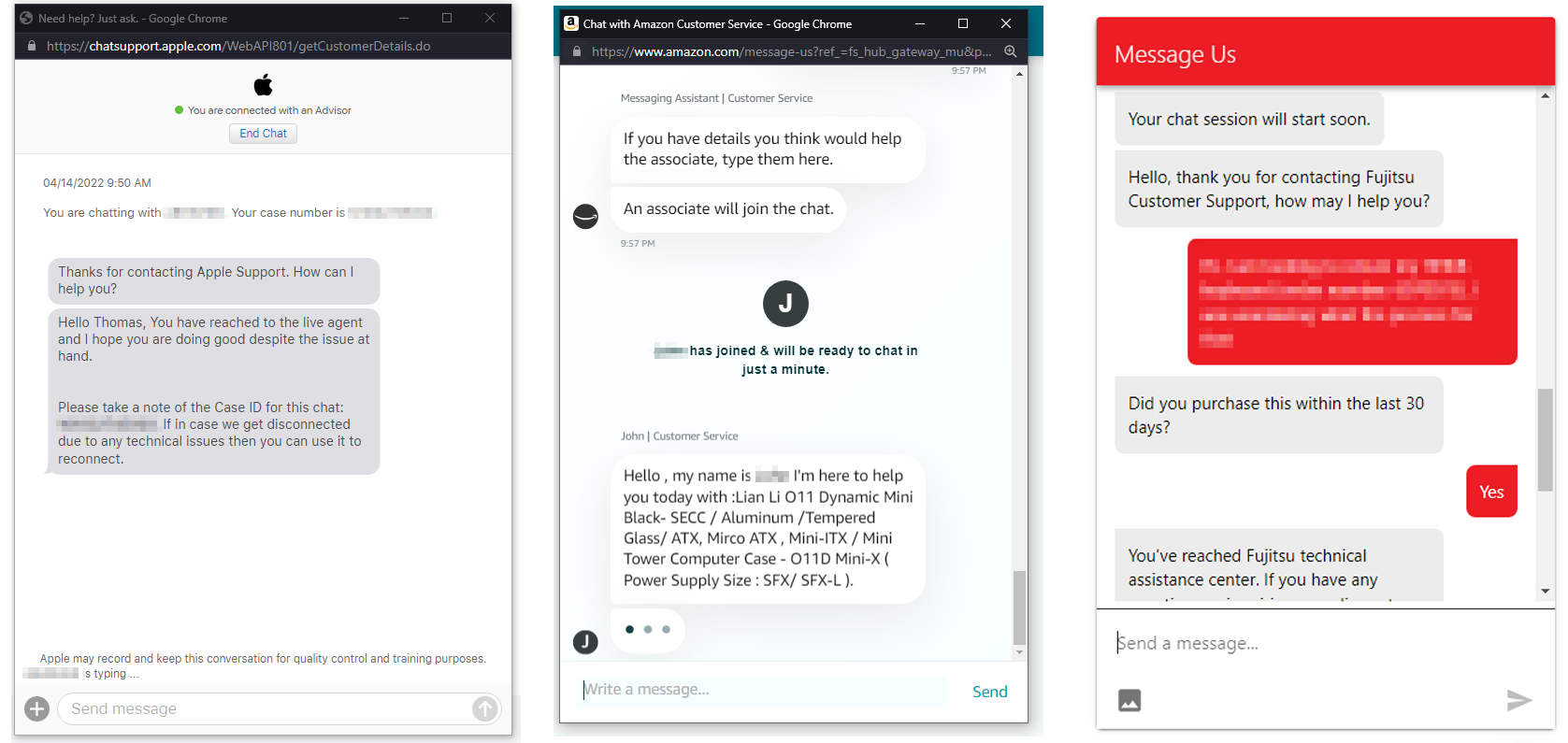
Currently, the advisors are using two monitors-one monitor for the main emergency service application and another monitor for miscellaneous related applications.

I like to start by understanding how the technology works and any limitations. One requirement that caught my attention was, "Could be dragged to a different/secondary screen." Web applications contain modals within the system. So the modals cannot leave the application or browser's tab.

There were several back-and-forth conversations between business and development (including me) on approaching this. Instead of creating a modal within the system, we decided to have the messenger be an independent system that relies on the emergency service application.

Additionally, a new browser window would house the messenger. The advisor can move the messenger browser window anywhere on their screen.
Our team reached out to the UX research team to conduct user testing to gather feedback on initial thoughts about an emergency messaging feature. The research team interviewed 17 participants, and one result stood out to us:
It would be massively beneficial to those who have impaired hearing.
At this point, we decided to change our project focus statement to:
We need an instant messaging feature for users who cannot talk on the phone.
I started out with the initial framework by referencing and understanding other instant messaging and customer support chat platforms. I even reached out to a friend who worked as a customer support technical to get his perspective and a glance at how his chat platform worked.

This area was intended to house information and action pertaining to the overall chat message box such as:
This is the body of the chat box where the chat messages are displayed.
To access additional features that are supplementary to the messages, there's a stick footer at the bottom. Features such as pre-defined sentences dropdown.
This was one of the features we came up with to help advisors have faster responses. The idea came from when I was writing an email and Gmail predicted what I was going to write next. Some machine learning magic will try to predict the complete sentence as the advisor types.

I combed through the advisor's playbook that contained a list of specific sentences for the advisors to use. I worked with the product owner in bringing this list into the chat box to help reduce typing. By clicking on chat message icon in the bottom left, advisors can select quick messages.

The animations and wireframes above were created in Adobe XD because of its recording functionality, but I prefer designing and creating prototypes in Axure.
I relied on my programming knowledge and experience during this project, and it gave me a voice and helped explain the technical difficulties to the product owners. This project made me realize that I heavily focus on the interaction between the users and components. I learned that I take projects on a very systematic approach and build from the technological framework to stay within the realm of realistic possibilities.